Physical Design
Literature:
- Benyon, D. (3rd edition): Chapter 4, section 4.5 + Chapter 9, sections 9.5 and 9.6 + Chapter 12, sections 12.1-12.3.
- Nielsen (1994): Enhancing the Explanatory Power of Usability Heuristics (PDF)
- Petrie (2012): What do users really care about?: a comparison of usability problems found by users and experts on highly interactive websites (PDF)
Abstract vs. concrete design.
Abstract (Conceptual design):
Determining the following:
- Logic
- Functions
- Structure
- Content
Concrete design:
Physical realization of the same (logic, functions, ...)
The UI: "Everything in the system that people come in contact with"
Difference user interfaces: Command prompt and GUI (Graphical User Interface).
Command Prompt
Some things can be done fast by expert users.
Graphical User Interface
Direct Manipulation
Example: Windows File Manager
- Continuous representation of the object of interest
- Physical actions or labeled button presses instead of complex syntax
- Rapid incremental reversible operations whose impact on the object of interest is immediately visible
User friendly for novice user.
WIMP
- Windows
- Icons
- Menus
- Pointers
Icons
Holton's icon checklist
- Understandable
- Familiar
- Unambiguous
- Memorable
- Informative
- Few
- Distinct
- Attractive
- Legible (Easily readable)
- Compact
- Coherent
- Extensible
Menus
Different types of menus:
- Cascading
- Pop-up
- Contextual
Cascading Menu
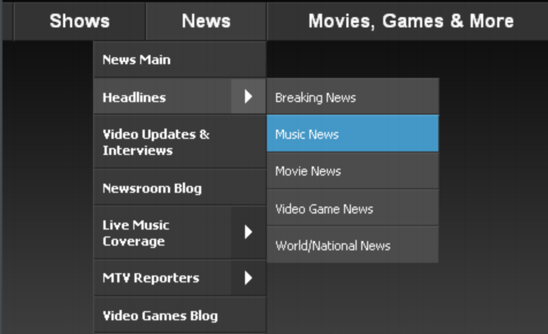
It cascades/unfolds.
Compacting the information visible to the user.
Popup Menu
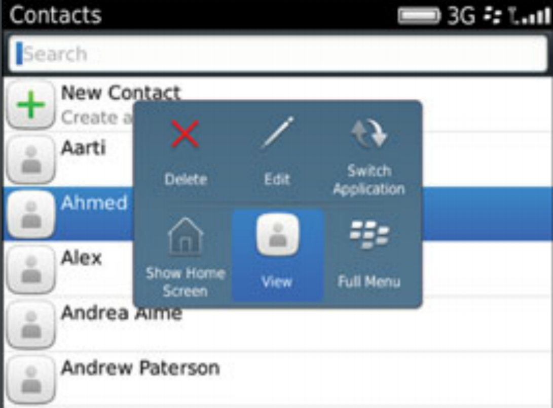
Contextual Menu
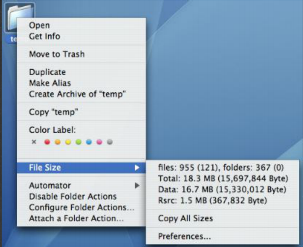
Typically right click on folder/file you want to access.
Adapts based on the context.
Widget Guidelines
Radio Buttons
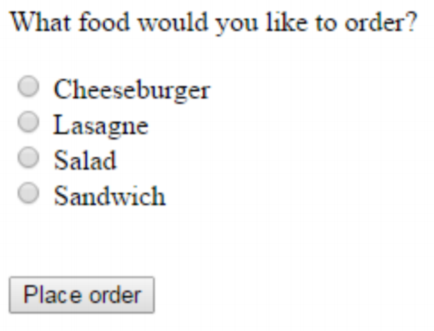
You can only select one item.
Mutual exclusiveness.
Checkboxes
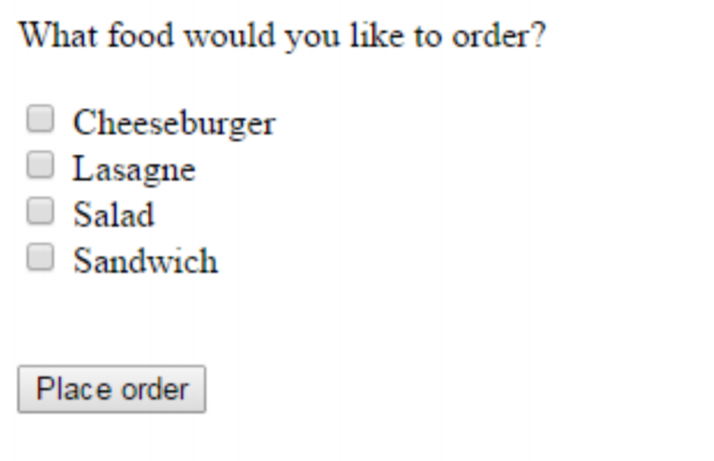
You can select more than one.
Toolbars


More examples:
- Textbox
- Dropdowns
- Date
- Textarea
- Password
- Tel
- URL
- And many more
Nielsen's Heuristics
- Visibility of systems status
- Match between system and real world
- User control and freedom
- Consistency and standards
- Error prevention
- Recognition rather than recall
- Flexibility and efficiency of use
Petrie and Powers' heuristics
Physical presentation:
- Make text and interactive elements large and clear enough
- Make page layout clear
- Avoid short time-outs and display timeouts
- Make key content and elements and changes to them salient[^salient]
Content:
- Provide relevant and appropriate content
- Provide sufficient but not excessive content
- Provide clear terms, abbreviations, avoid jargon
Information Architecture:
- Provide clear, well-organized information structures
Interactivity:
- How and why?
- Clear labels and instructions
- Avoid duplication/excessive effort by users
- Make input formats clear and easy
- Provide feedback on user actions and system progress
- Make the sequence of interaction logical
- Provide a logical and complete set of options
- Follow conventions for interaction
- Provide the interactive functionality users will need and expect
- Indicate if links go to an external site or to another webpage
- Interactive and non-interactive elements should be clearly distinguished
- Group interactive elements clearly and logically
- Provide informative error messages and error recovery
[^salient]: most noticeable or important. (Dansk: fremtrædende)